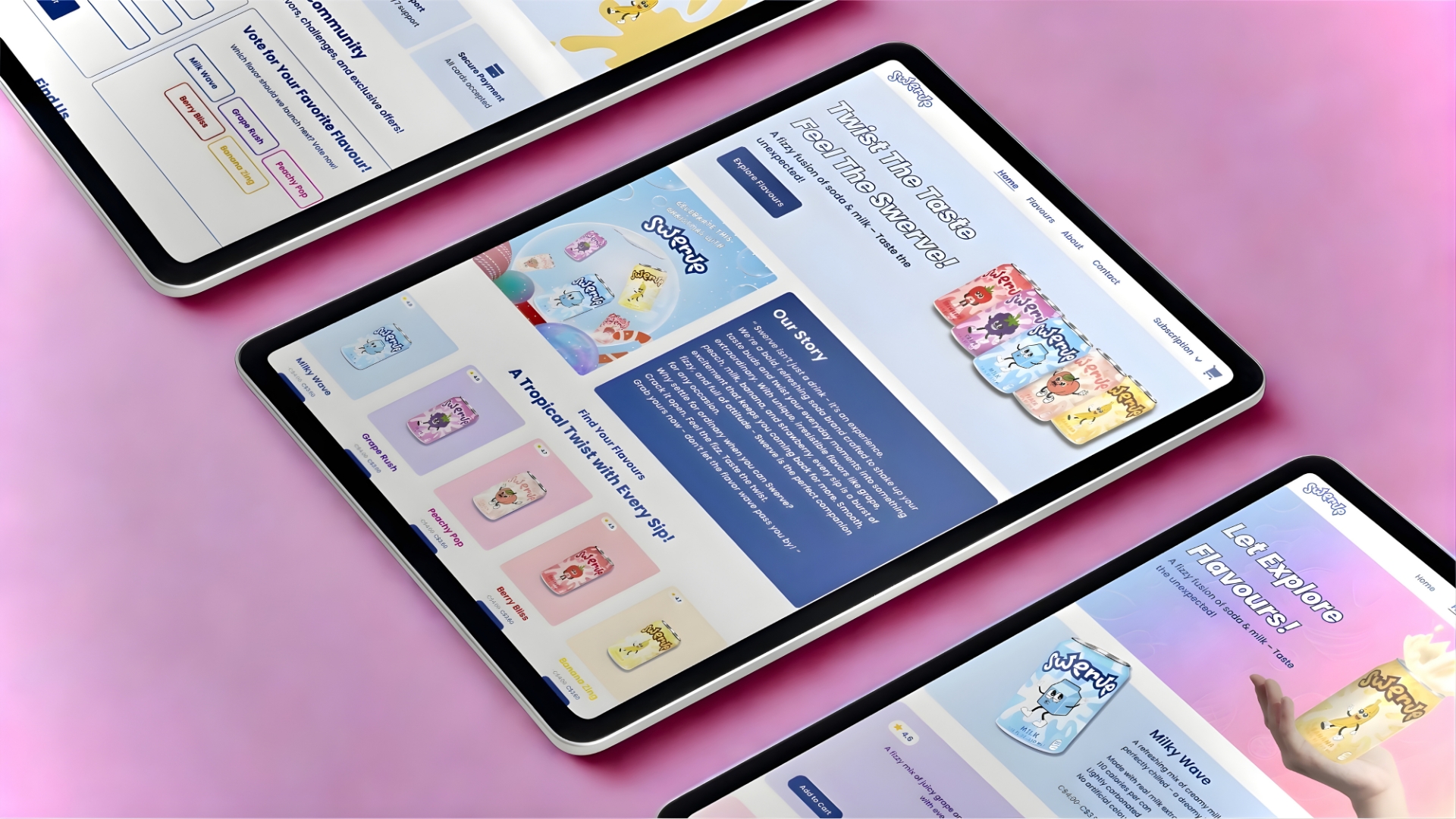
SWERVE DRINKS
DESCRIPTION
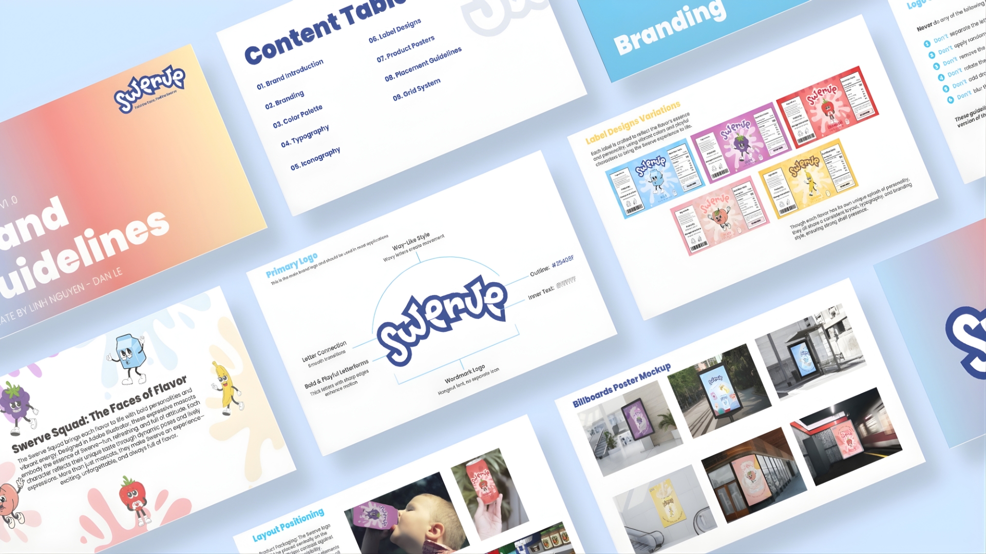
Swerve is a beverage brand that once existed in the market but eventually faded due to various circumstances. This project brings the brand back to life through a complete reimagining of its identity, transforming it into something fresher, more youthful, and more relevant for today’s audience.
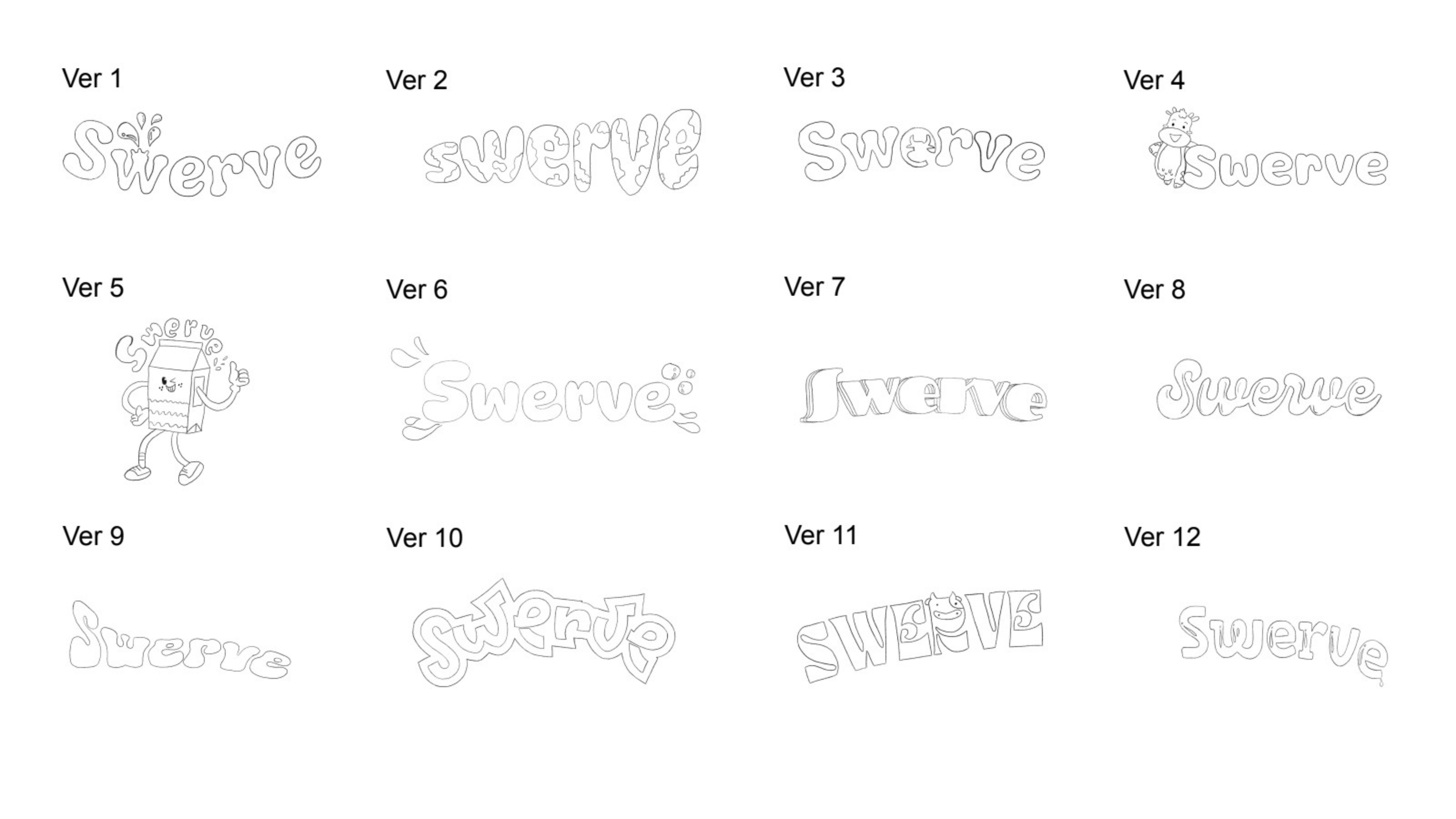
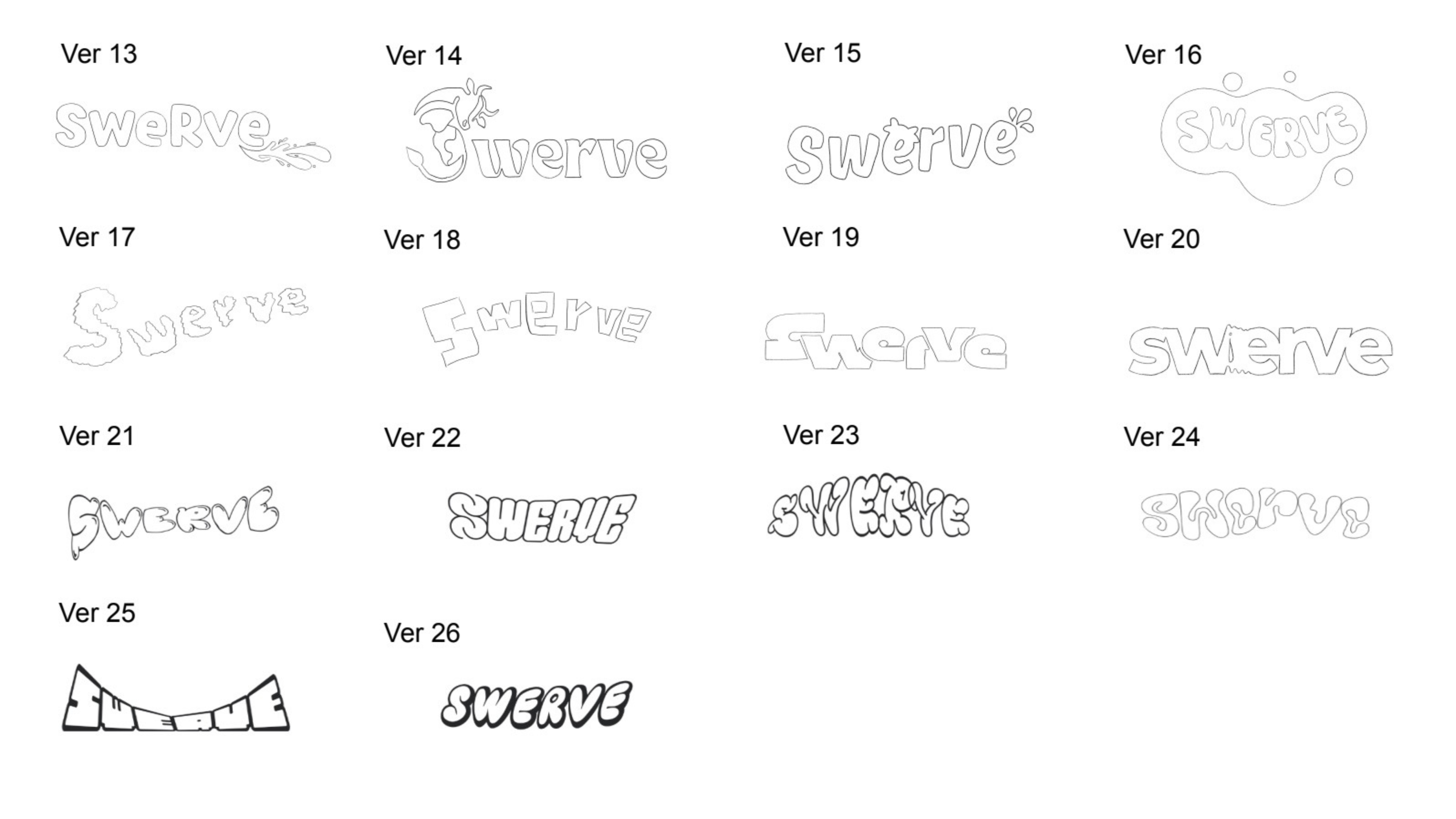
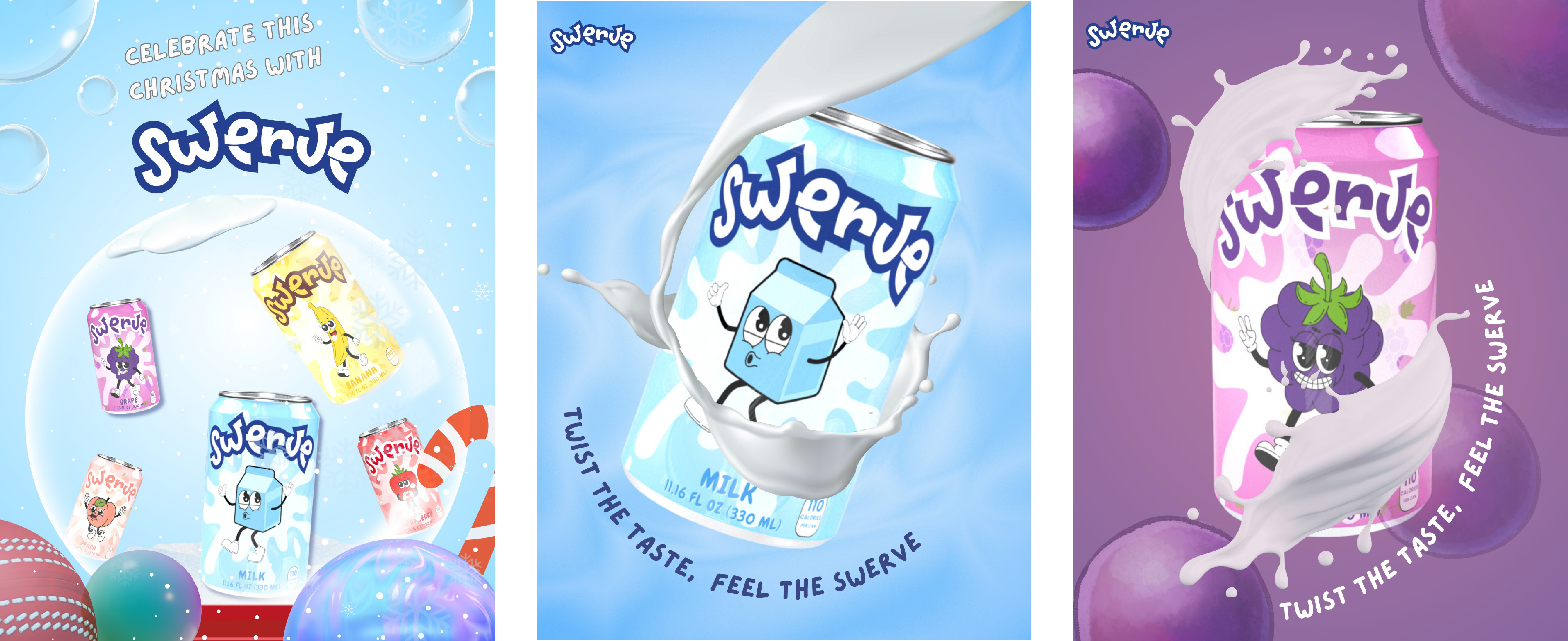
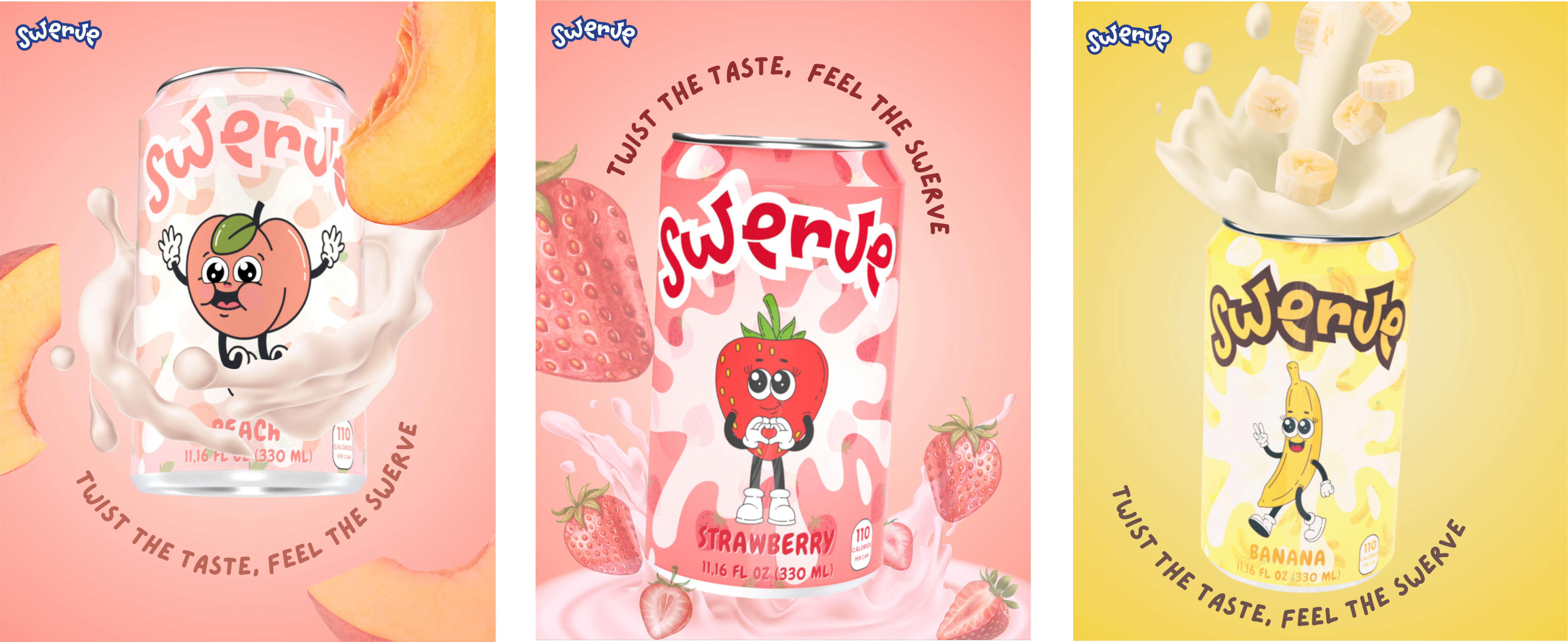
The rebrand introduces a new logo system and five vibrant drink flavors designed to appeal to young consumers. Each flavor carries its own playful personality, supported by bold visuals and a cohesive design language.
ROLE
Graphic Designer, Motion Designer, Web Developer
DELIVERABLES
Brand Identity Redesign, New Logo System, Visual Language And Color Direction, Packaging Design For Five Flavors, Promotional Drink Illustrations And Imagery, Social Media Mockups And Marketing Assets, Video Design And Promotional Motion Assets.
GOALS
1. Redefine the brand identity to create a fresh, youthful, and modern visual direction.
2. Develop a new logo system that reflects the brand’s renewed personality and energy.
3. Create five unique drink flavors with distinct visual styles that appeal to a younger audience.
4. Establish a cohesive design system across packaging, illustration, and promotional materials.
5. Produce engaging marketing visuals and motion assets to support the brand’s relaunch.
CHALLENGES
1. Finding a new visual direction that felt refreshed and modern while still preserving the brand’s core values was a major challenge, especially when rethinking the identity from the ground up.
2. Selecting vibrant, youthful color palettes and typography that appealed to a younger audience without losing sophistication required careful consideration and testing.
3. Designing five unique drink flavors that looked distinct yet visually cohesive posed a creative challenge, particularly in balancing variety with consistency.
4. Creating playful, energetic visuals that felt youthful without appearing overly childish demanded precise control over style, tone, and illustration choices.
5. Developing five custom mascot characters — Milk, Grape, Strawberry, Peach, and Banana — while maintaining consistency across all deliverables, from packaging to promotional assets, required strong visual discipline and coordination.
Detail Shots
LEARNINGS
1. Learned how to reimagine and restructure an existing brand through a complete visual refresh, building a youthful and energetic brand direction aligned with current design trends.
2. Learned to create appealing packaging by designing a cohesive system of five flavors that remain visually distinct while maintaining strong brand consistency.
3. Learned how to control color, tone, and illustration style across multiple products, ensuring a unified look throughout the entire packaging line.
4. Learned to apply playful transitions and lively motion timing to enhance promotional visuals and strengthen the brand’s energetic personality.
RESULTS
1. Delivered a refreshed brand identity that feels youthful, energetic, and visually aligned with current trends.
2. Created a cohesive packaging system featuring five distinct yet unified flavors, each supported by strong visual storytelling.
3. Developed a consistent illustration and color style across all brand materials, enhancing recognition and overall visual harmony.
4. Produced engaging promotional visuals and motion assets that highlight the brand’s playful personality and improve audience appeal.